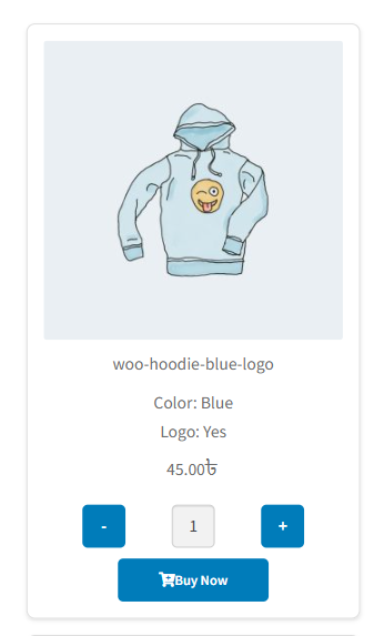
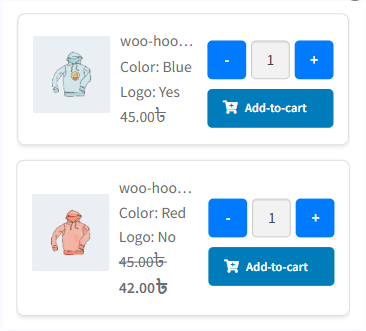
The “Design for Mobile Single Product Page” setting in the Variation Monster plugin allows you to choose from four different responsive templates specifically optimized for mobile devices. Since tables can be difficult to navigate on smaller screens, this feature provides flexible layout options to ensure the variation table remains user-friendly and visually clean on mobile.
Each template is designed to solve common mobile display issues like horizontal scrolling, cramped content, or poor touch interactions. You can select the one that best fits your design preferences and delivers a smooth shopping experience on smartphones and tablets.

Template One for the variation table on the single product page.
Template Two for the variation table on the single product page.
Template Three for the variation table on the single product page.
Template Four for the variation table on the single product page.
